Apps, portals, websites and brands I've designed with agencies and startups since 2022. Shorter stories than the case studies, made with the same care.
11 projects · 2022 to 2026
Role
Product designer
Via
Contracted through partner Pearl Street Labs
Year
2026
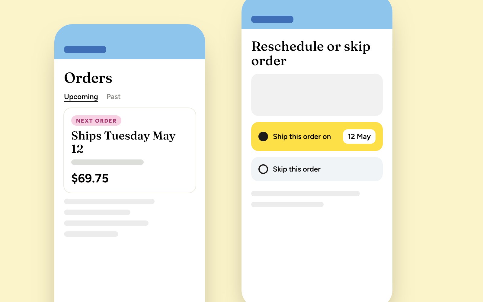
PupGum, a dog dental chew subscription brand, ran its subscribers through a default portal: generic, off-brand and not built to keep anyone. I'm redesigning it as a custom, on-brand portal with two goals: keep existing subscribers, and turn one-time buyers into subscribers.
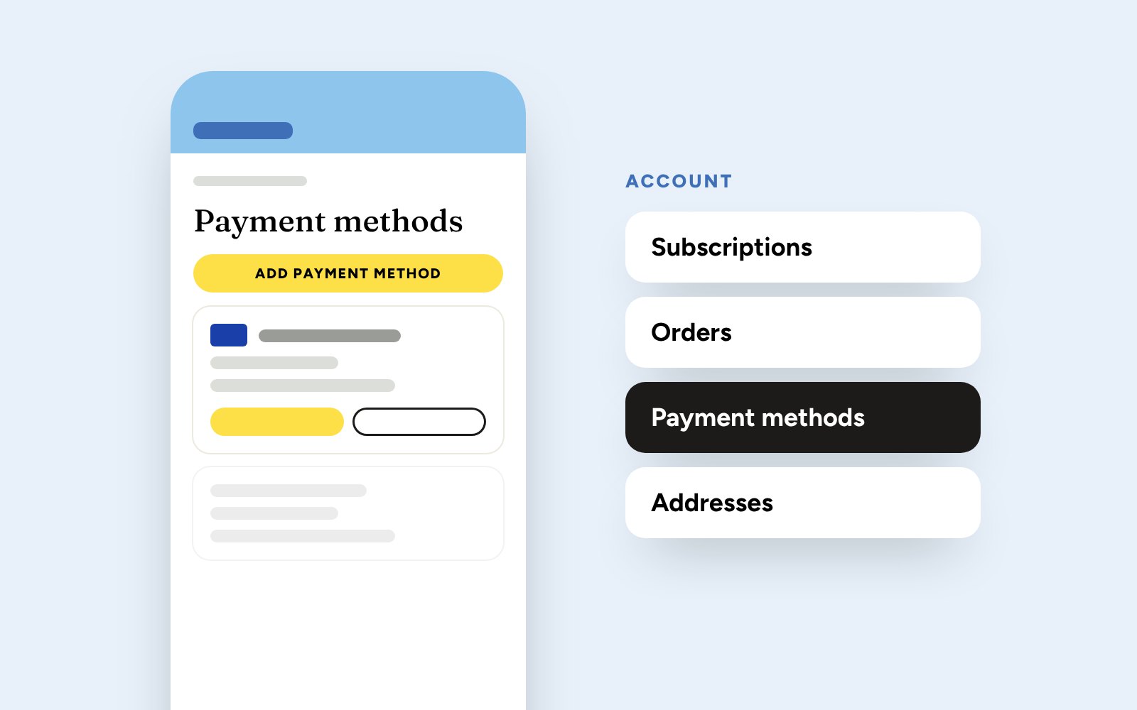
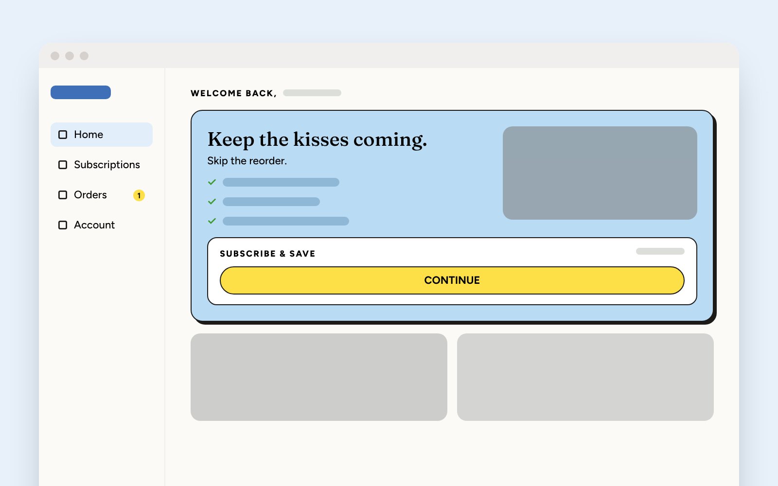
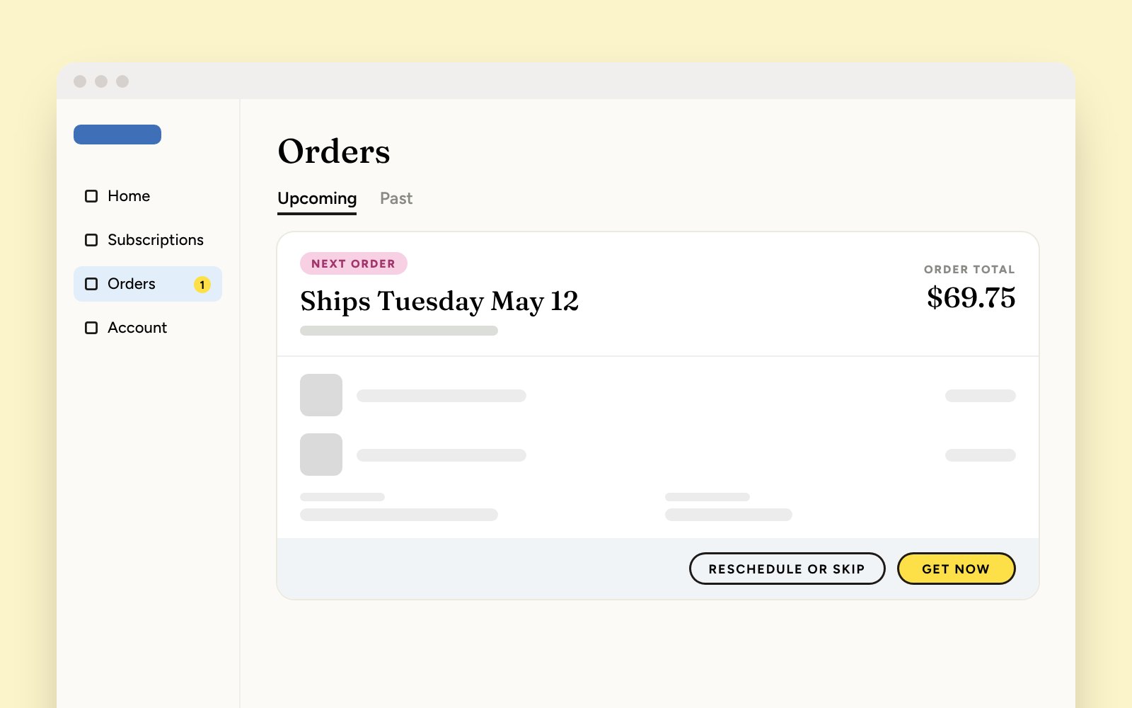
1Scope. Work spans the dashboard, orders, subscriptions, account settings and payment.
Outcome. Being built now.
Some designs are abstracted to respect client confidentiality.
Orders with the next one up front, and rescheduling or skipping a single orderAccount: subscriptions, orders, payment and addresses in one placeDesktop: the home dashboardDesktop: orders
Role
Product designer
Via
Contracted through partner Pearl Street Labs
Year
2026
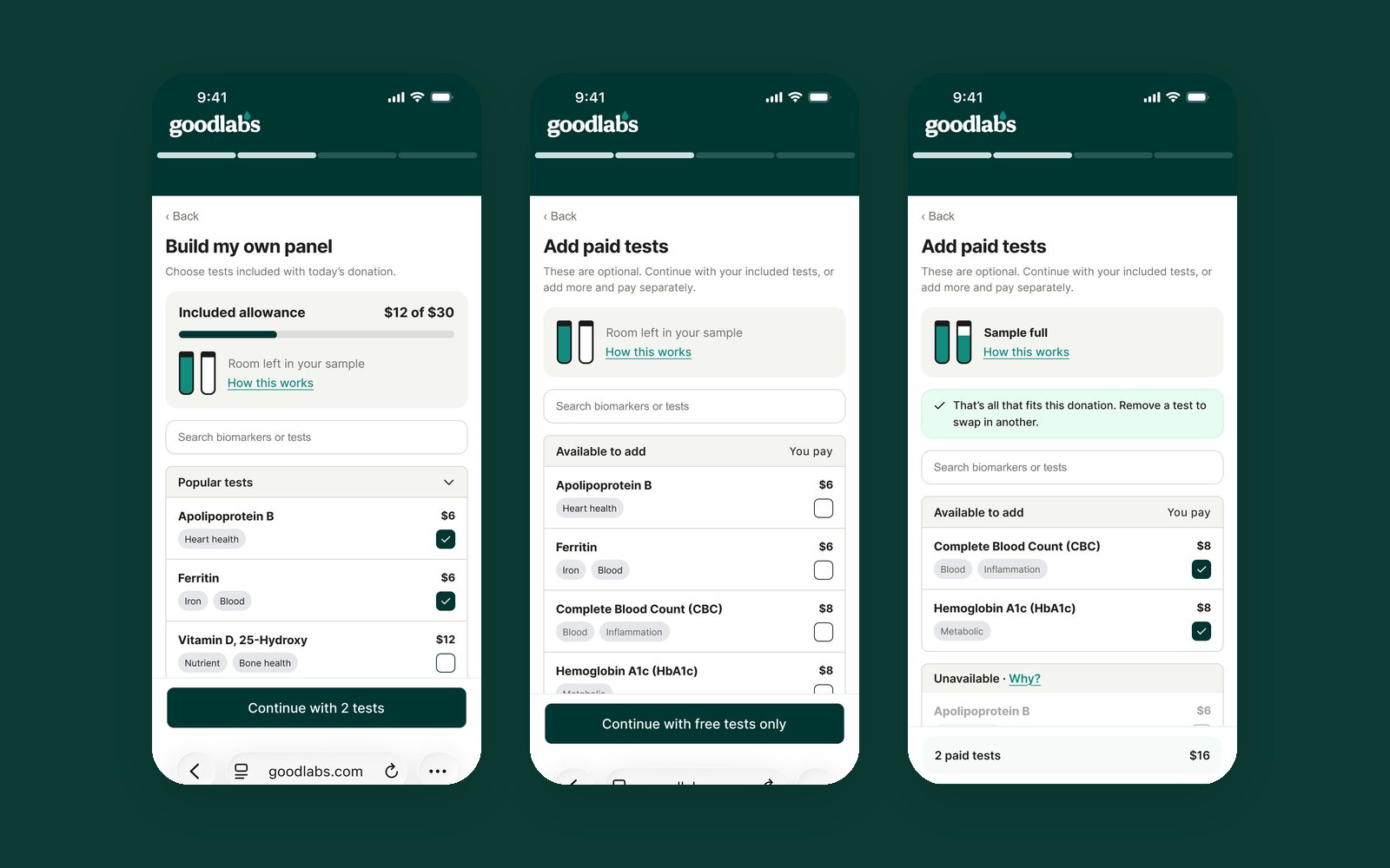
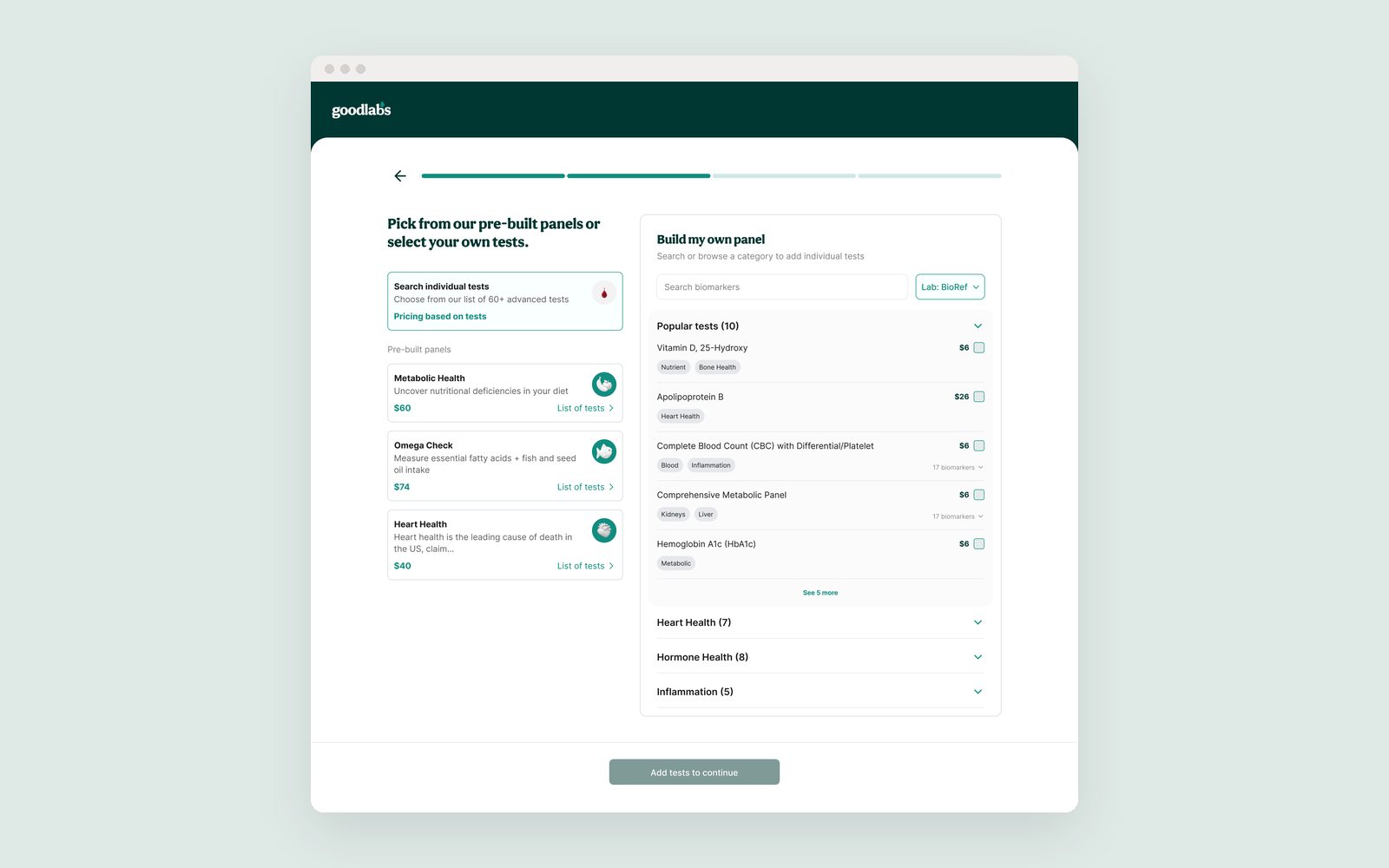
GoodLabs gives blood donors a free lab test as a thank-you. I worked on how donors book and choose their tests, where clinical rules about donations and blood samples make it easy to get things wrong.
1Booking flow. Cleaned up the existing flow so donors understand the clinical and donation rules without reading fine print.
2Test builder. Redesigned how donors choose their free tests, giving them more freedom to mix and match.
3Clear limits. Kept the clinical limits out of the way, surfacing them only when they matter.
Mobile: build your panel, add paid tests, reviewDesktop: a pre-built panel or your own
Role
Product designer
Via
Contracted through partner Pearl Street Labs
Year
2026
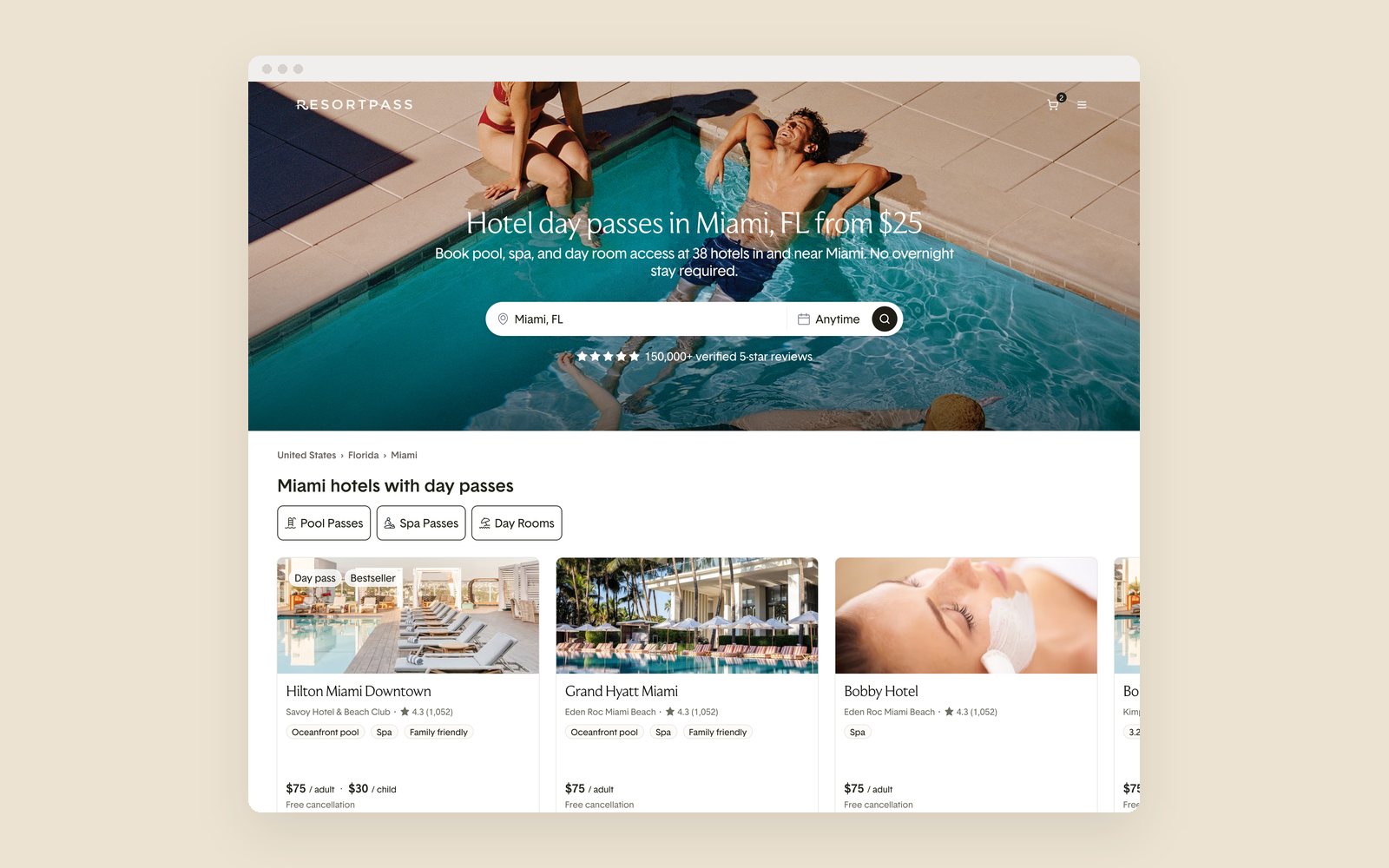
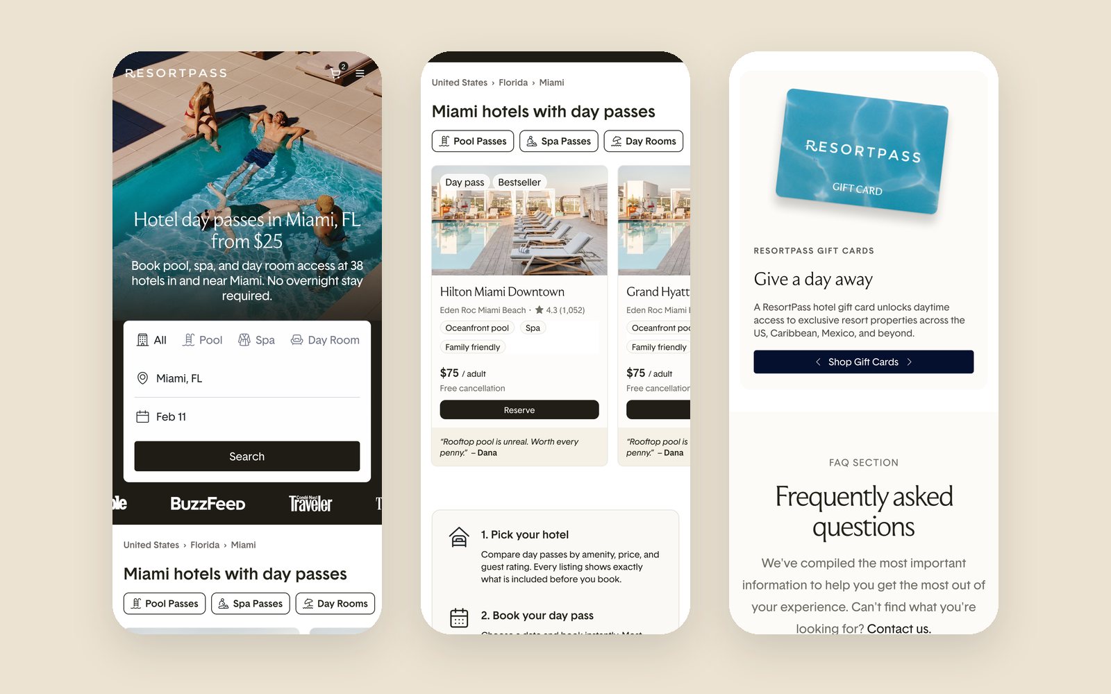
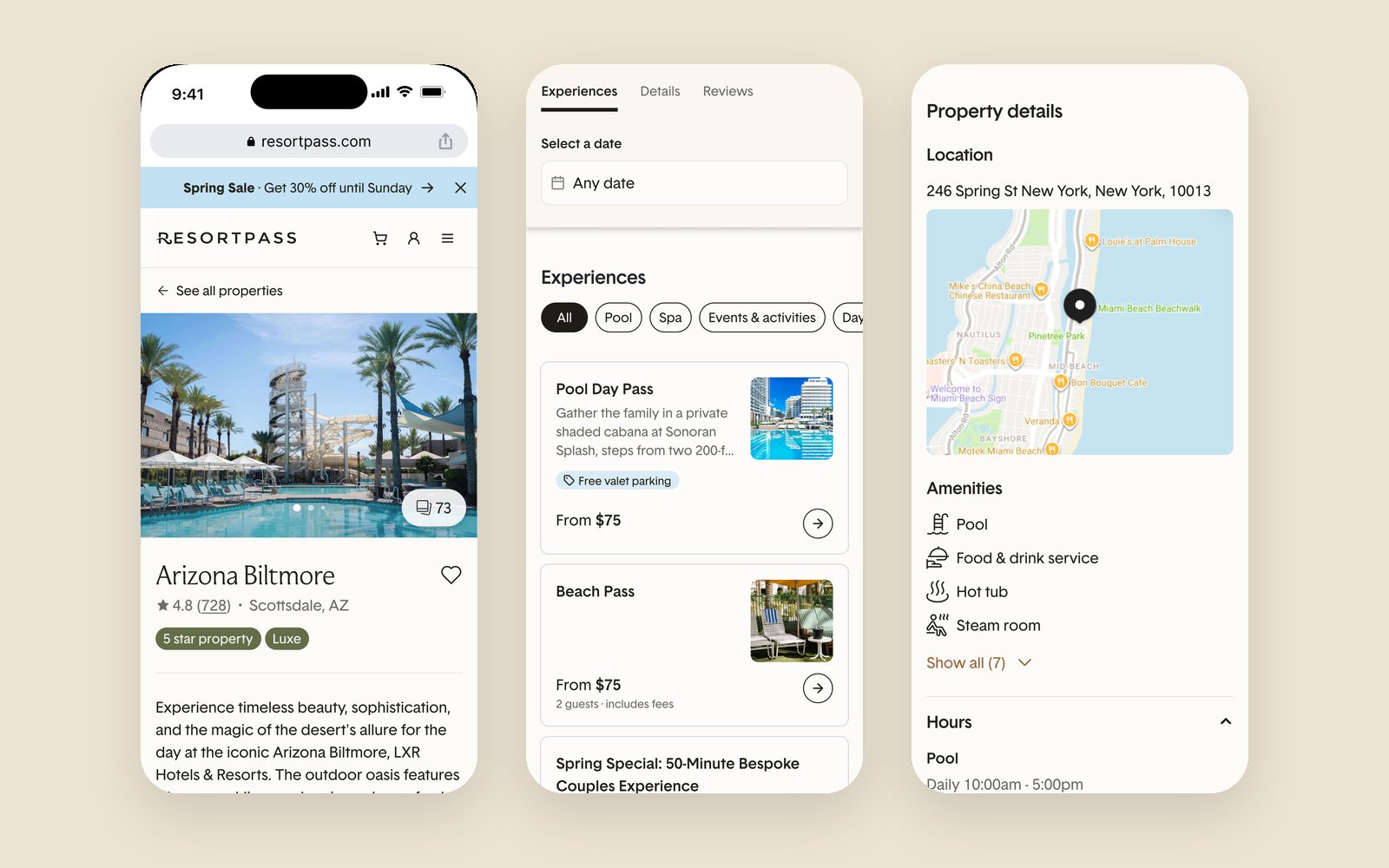
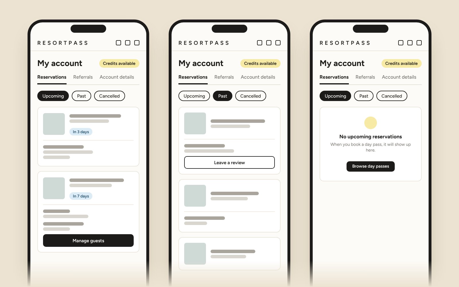
ResortPass sells day access to hotel pools, spas and cabanas. I work alongside their design lead across new features, conversion experiments and a move onto their new design system, from research to mobile and desktop handoff, often on quick turnarounds.
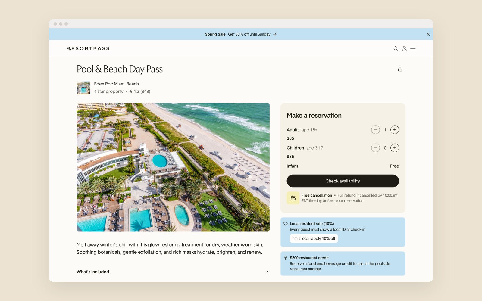
1Locals pricing. Resident discounts for a day-pass marketplace, from research to checkout.
2Conversion experiments. A/B test variants across the homepage, gift cards and reviews.
3Design system and SEO. Pages moved onto the new design system, mobile-first, including high-traffic SEO pages.
4Research. Competitive scans that fed product decisions.
Outcome. A gift card test against the previous design, run for 5 weeks: +123% gift card purchasers and +107% gift card GBV.
Some designs are abstracted to respect client confidentiality.
A public city page for SEO: Miami hotel day passes, on the new design systemLocals pricing: the local resident rate next to the reservation boxThe city page on mobile: search, hotel cards and gift cardsA property page on mobile: experiences, details and the mapThe account area: upcoming, past and empty reservations
Role
Product designer (navigation and IA)
Via
Contracted through partner Pearl Street Labs
Year
2026
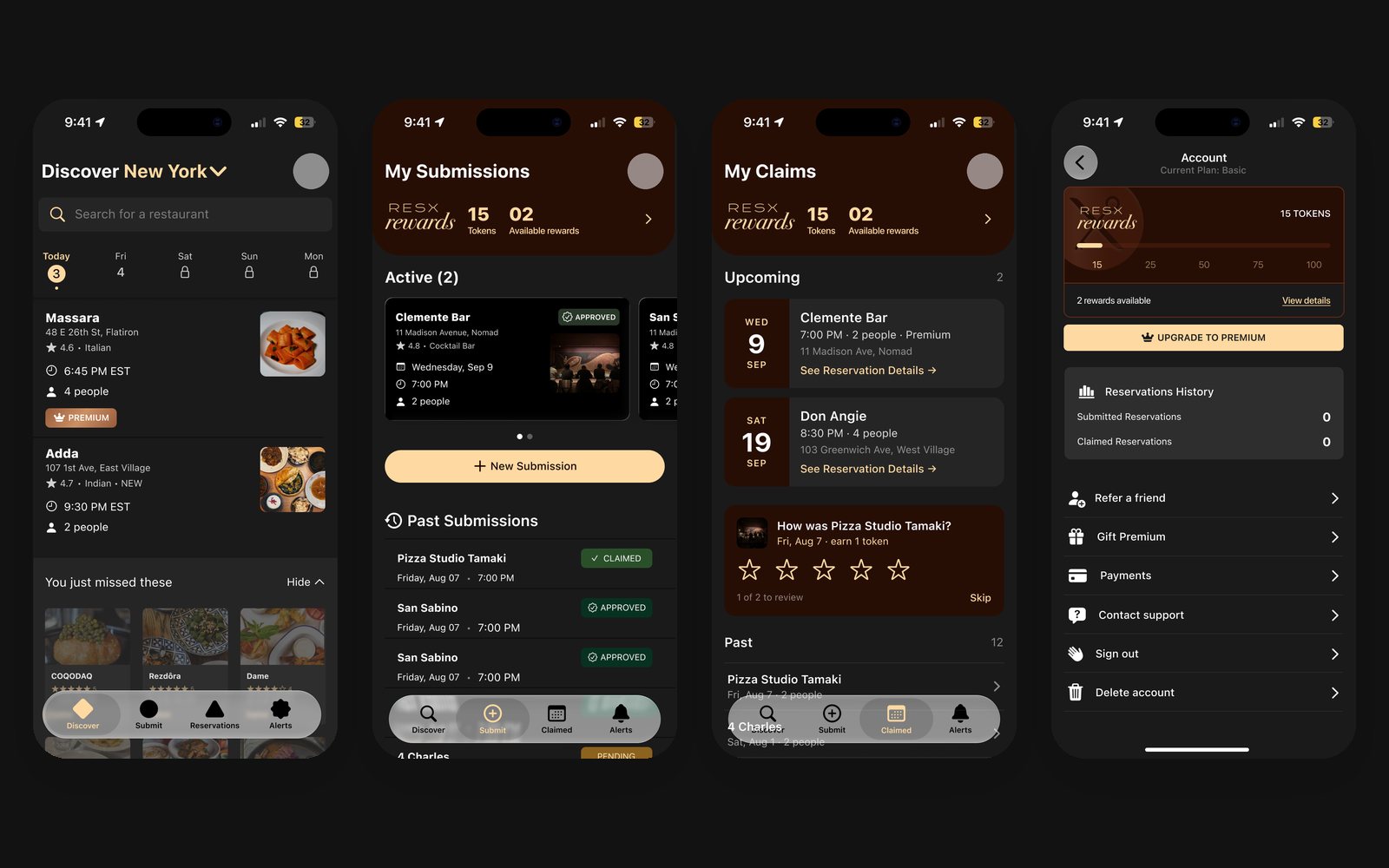
ResX lets people hand off restaurant reservations they can't use and claim ones others post. The app had grown five tabs that didn't match how people used it, so I was brought in to rethink its navigation and structure.
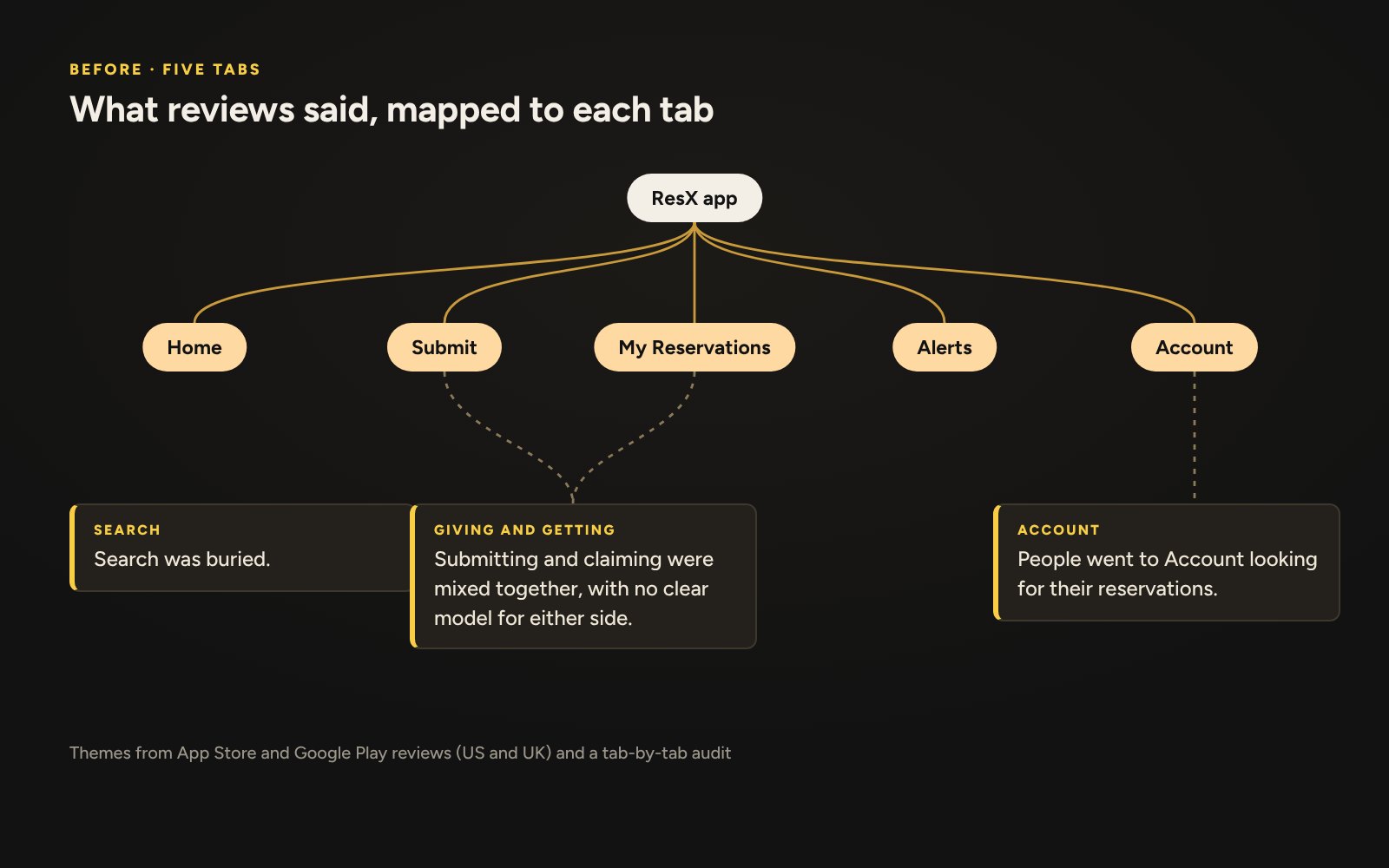
1Research. Audited what each tab was really for and mined App Store and Google Play reviews (US and UK) for pain points.
2The core problem. The app had no clear model for giving versus getting.
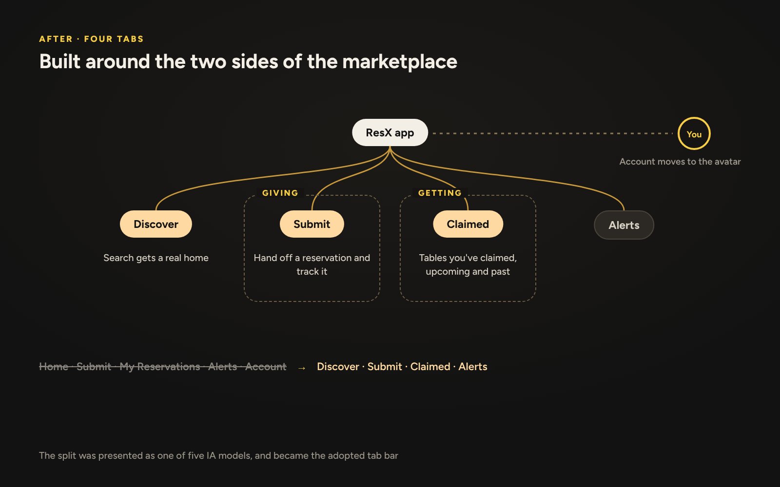
3New structure. Explored and proposed new navigation and IA models, weighing the trade-offs with the product lead.
The app: Discover, My Submissions, My Claims and AccountUser feedback: themes from app store reviews, mapped to the five original tabsSite map: from five tabs to four, built around giving and getting
Role
Brand designer
Via
Independent
Year
2025
A hardware rental startup in Malaysia refurbishes old equipment for students, small businesses and entrepreneurs. It needed a brand that felt both trustworthy and approachable.
1Naming. A questionnaire, founder interview and workshops took it from "Mavix" to "Reboot": second chances for people and for hardware.
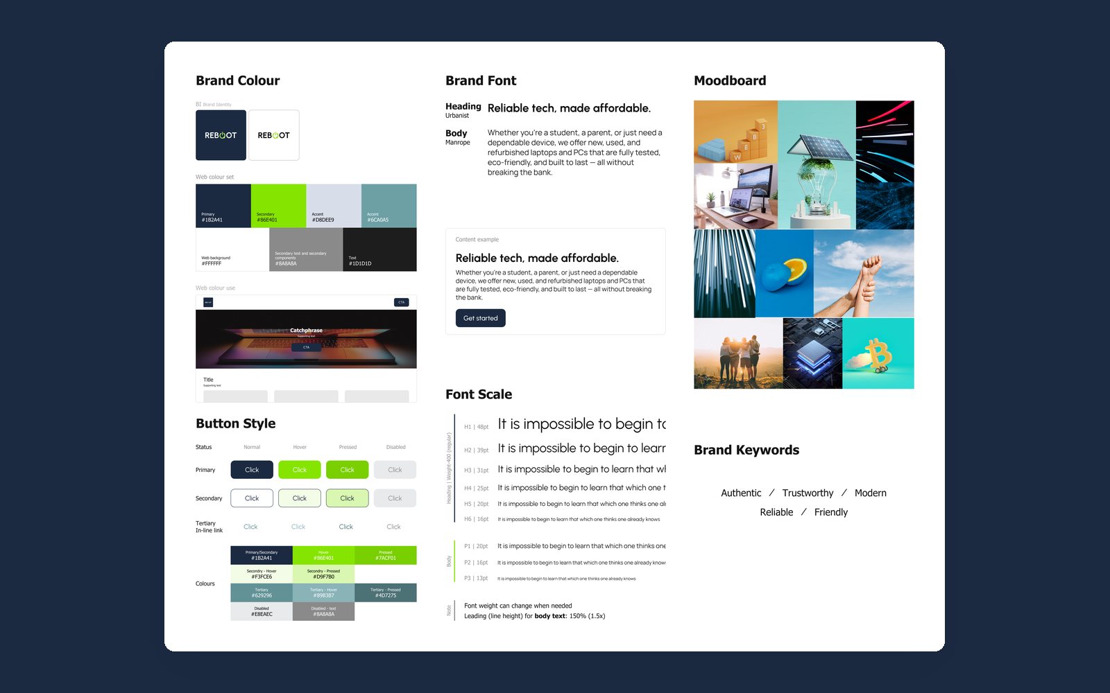
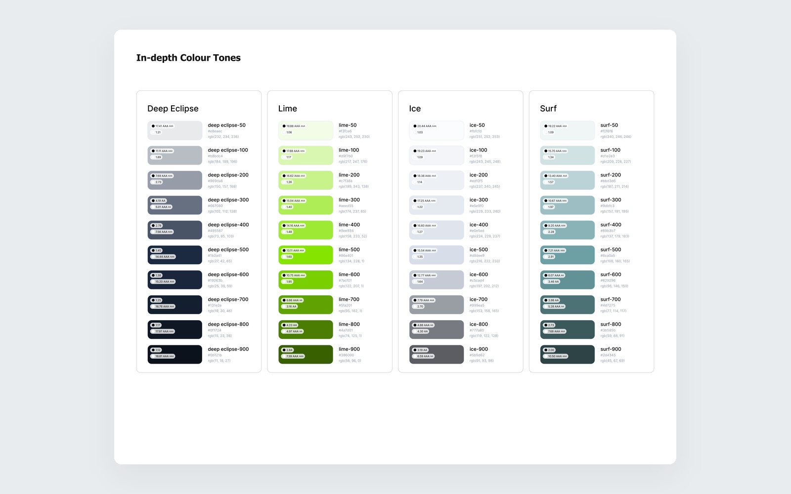
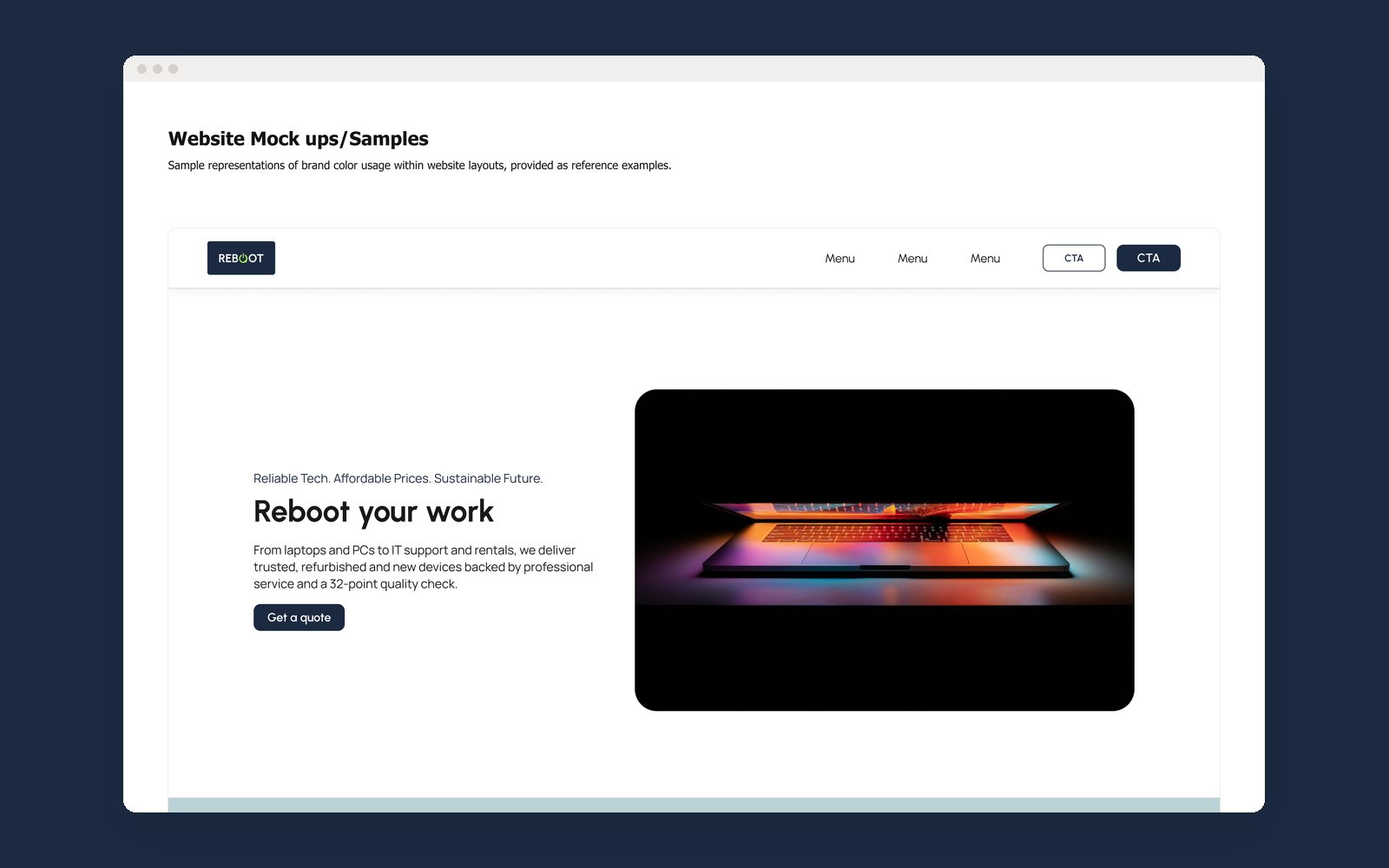
2Visual identity. Moodboards, palette explorations and type, tested through website mockups.
3Logo. A mark built from the power and restart symbol with a nod to the recycle arrow, packaged into brand guidelines.
The identity in motion: power on, then the wordmarkBrand guidelines: colour, type, buttons and moodboardColour tonesWebsite mockup with the new identity
Role
Solo UI/UX designer
Via
Independent
Year
2024
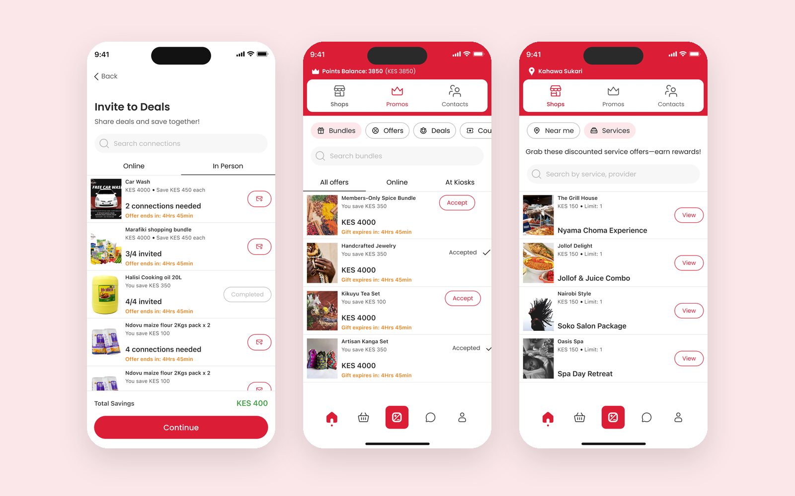
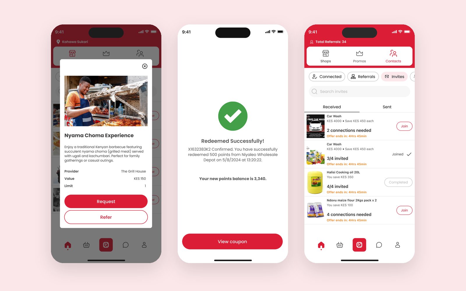
A rewards super-app combining shopping, gifting, group deals and parcel delivery. I took the founder's wireframes to production-ready designs in two months: 50+ screens across 10+ feature areas, on an existing design system.
1Clarity. Each transaction type got its own look, so people can tell gifts, deals and redemptions apart at a glance.
2Structure. 10+ feature areas under one navigation, with helper text, step-by-step onboarding and error states that explain the problem.
3Founder partnership. Delivered the founder's vision while flagging UX gaps along the way.
Outcome. Launched with a marketing site.
"Clarinne works like she has front row seats in my brain, able to bring my vision to life without me explaining too much."
Anthony G., Founder
Deals, bundles and servicesService details, redeeming points and invites
Role
UX specialist
Via
fourtitude.asia
Year
2023
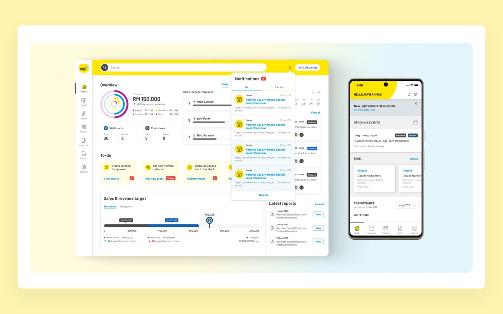
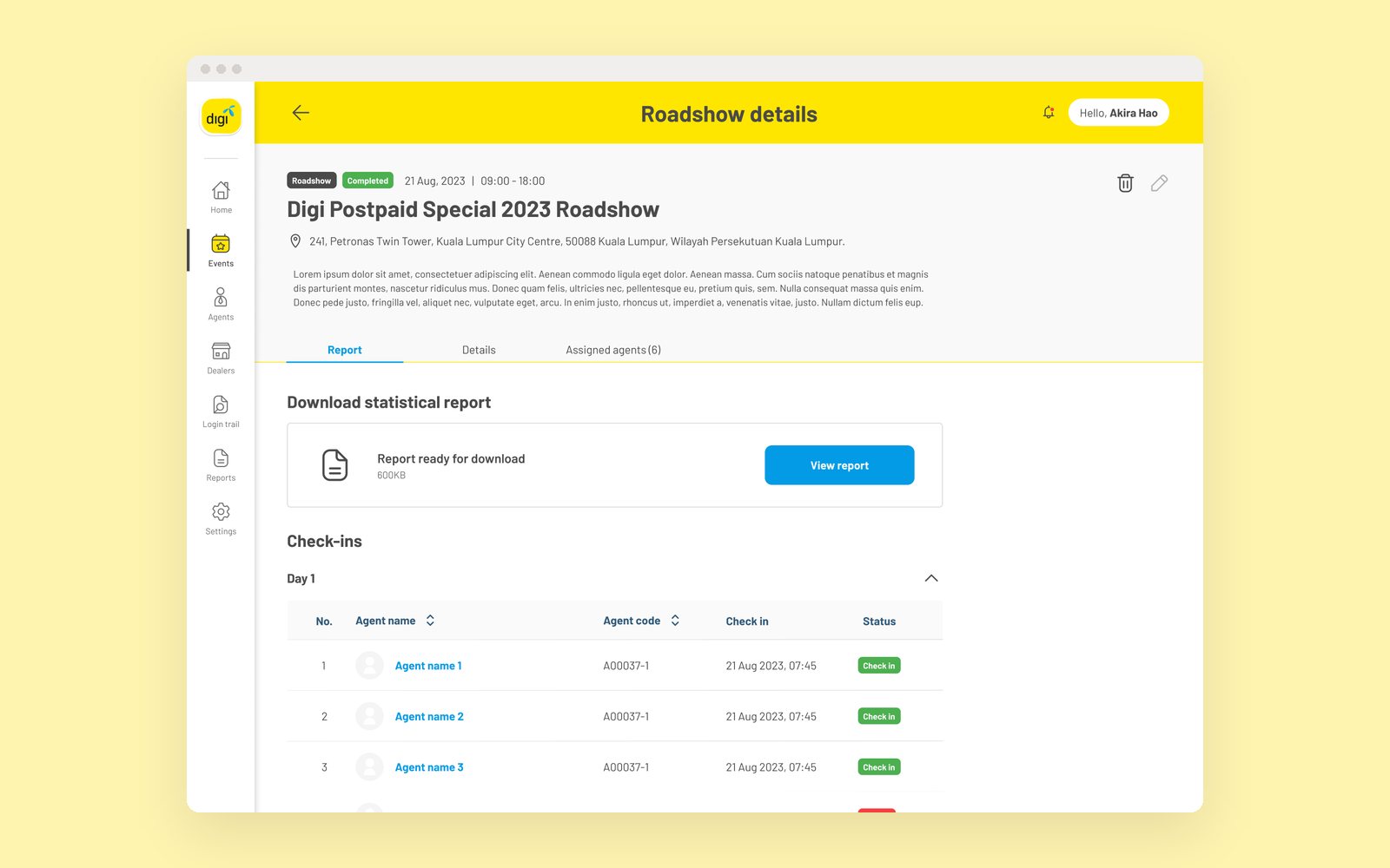
Digi's field sales teams ran their roadshows on old, disorganised processes. I covered UX/UI, user research and project management for a mobile app and a manager dashboard.
1Research. A discovery workshop and interviews with sales managers and field executives.
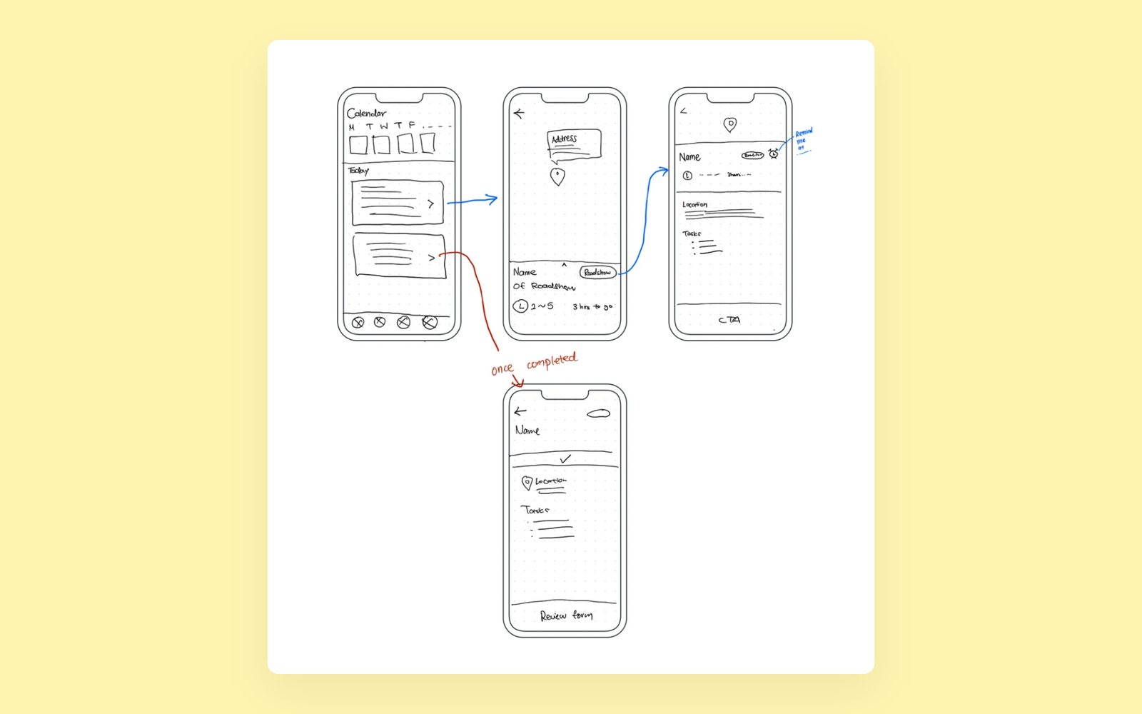
2Testing. Sketches to prototypes, with user testing that added a roadshow map and issue comments.
3Two sides. A dashboard for managers (KPIs, plans, auto reports) and an app for executives (roadshows, dealers, tasks).
Outcome. Handed to Digi's in-house engineers to build.
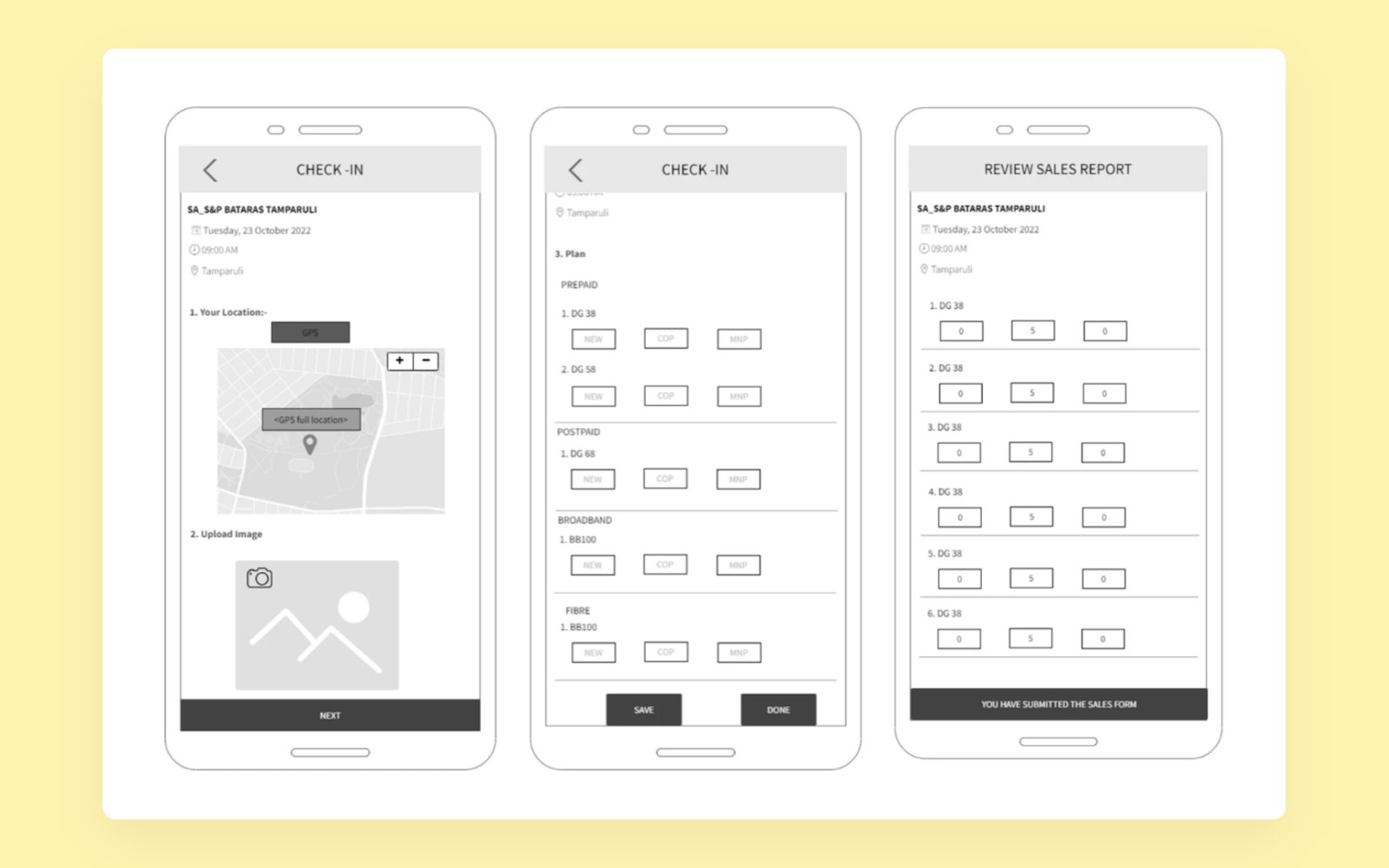
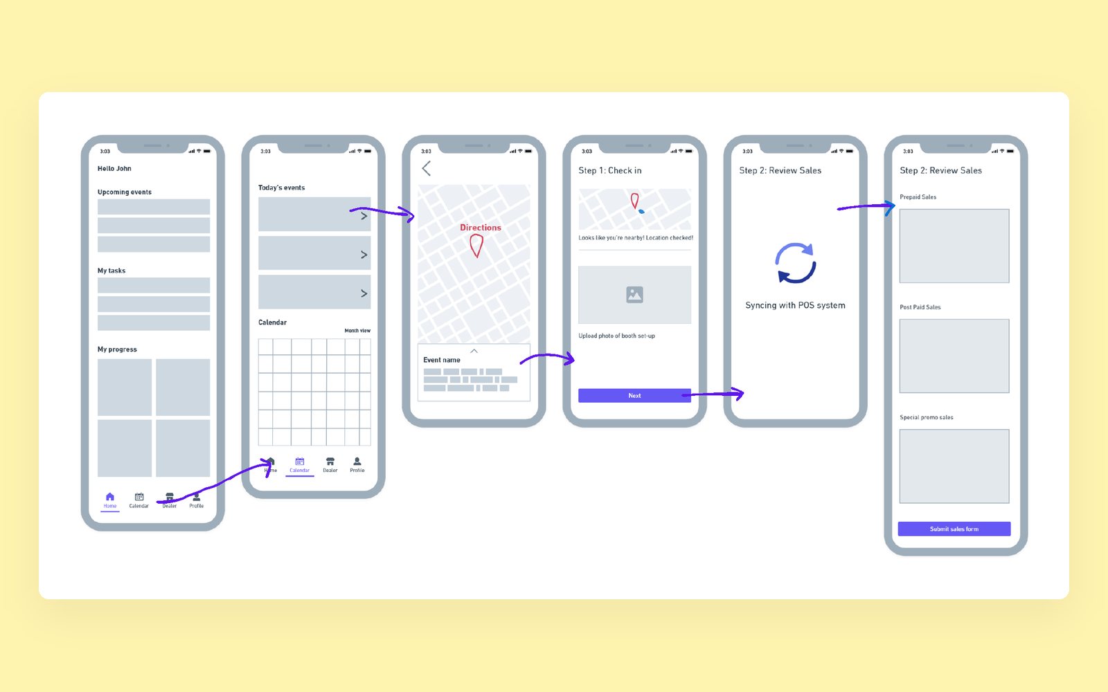
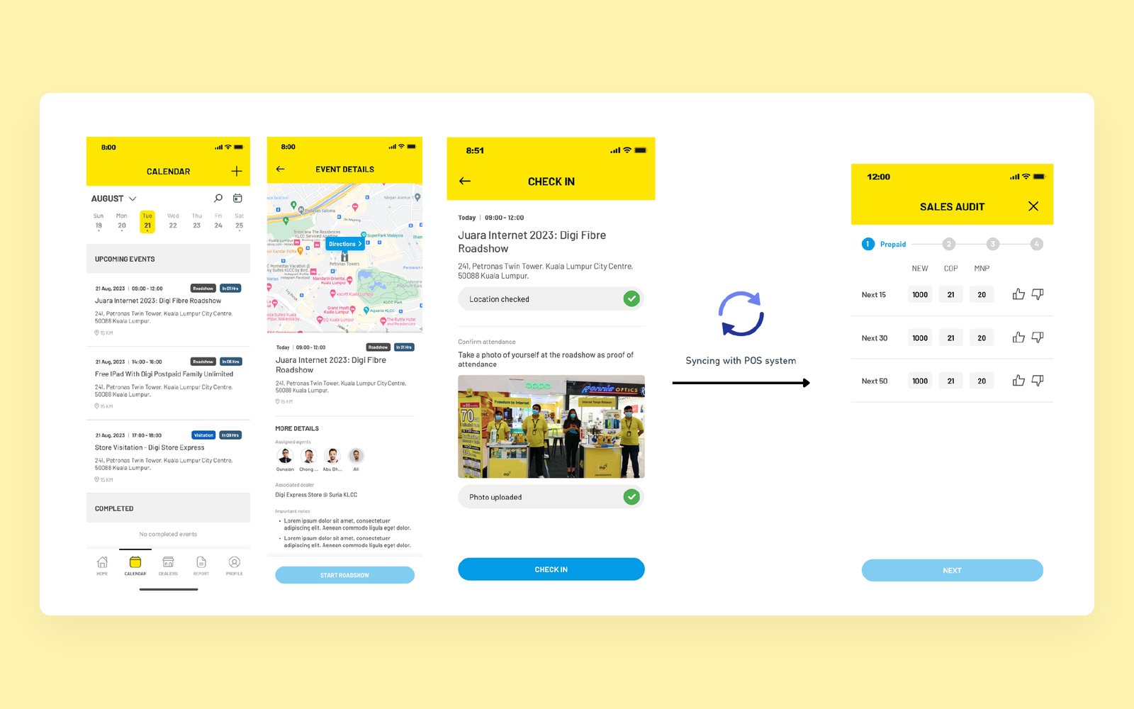
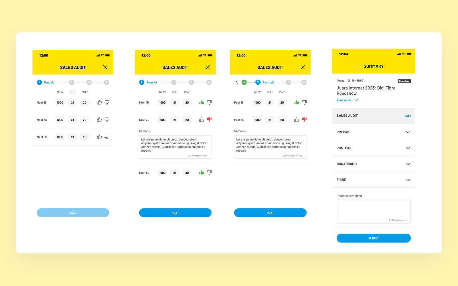
Early sketches: the roadshow list, the map, and a reminder once a roadshow is doneWireframes for agents: check in at the location, a photo of the booth, record sales, submitUsability testing, round 2: from today's events to check-in and the sales reviewFinal flow: calendar, roadshow details, check-in with a photo as proof of attendance, then syncing with the POS systemFinal flow: a sales audit by product line, then a summary to submitManagers see roadshows, visitations and sales targets on the dashboard, while agents get the same events on their phoneAfter a roadshow, managers get the report and every agent's check-in status
Role
UX specialist
Via
fourtitude.asia
Year
2023 to 2024
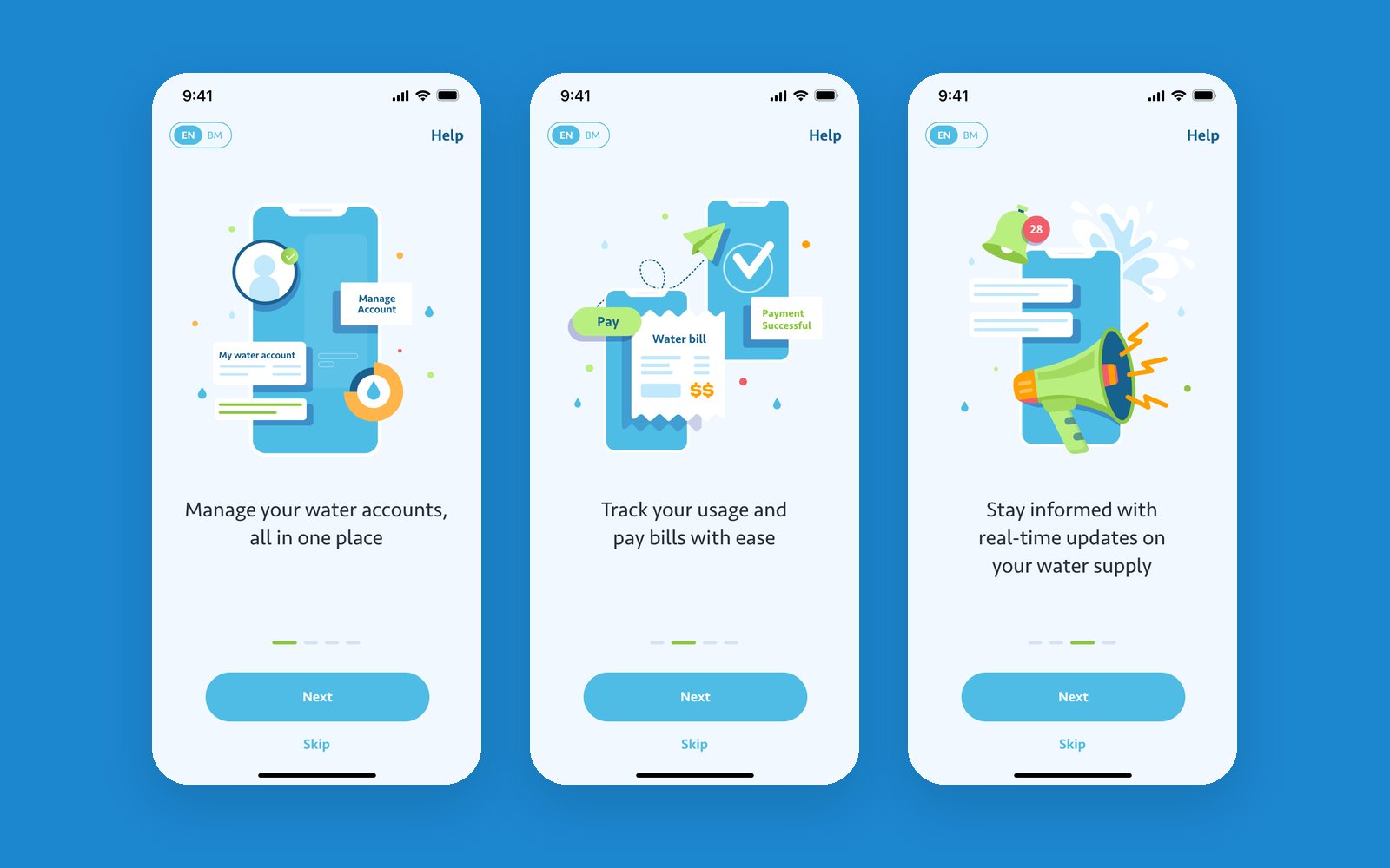
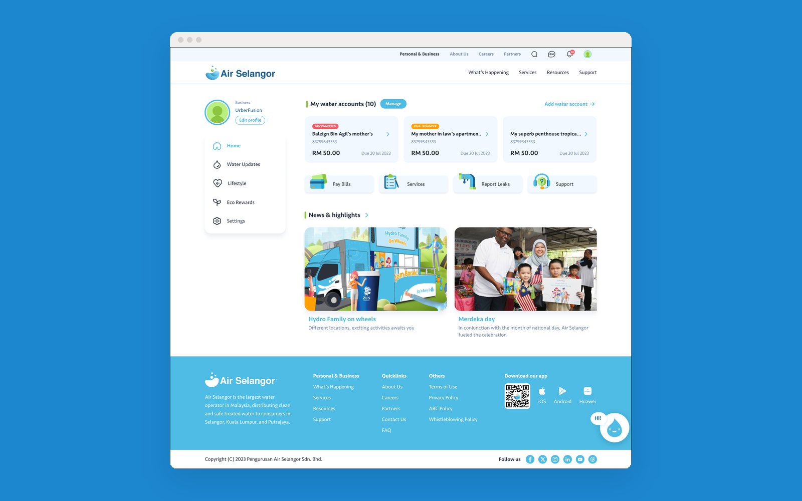
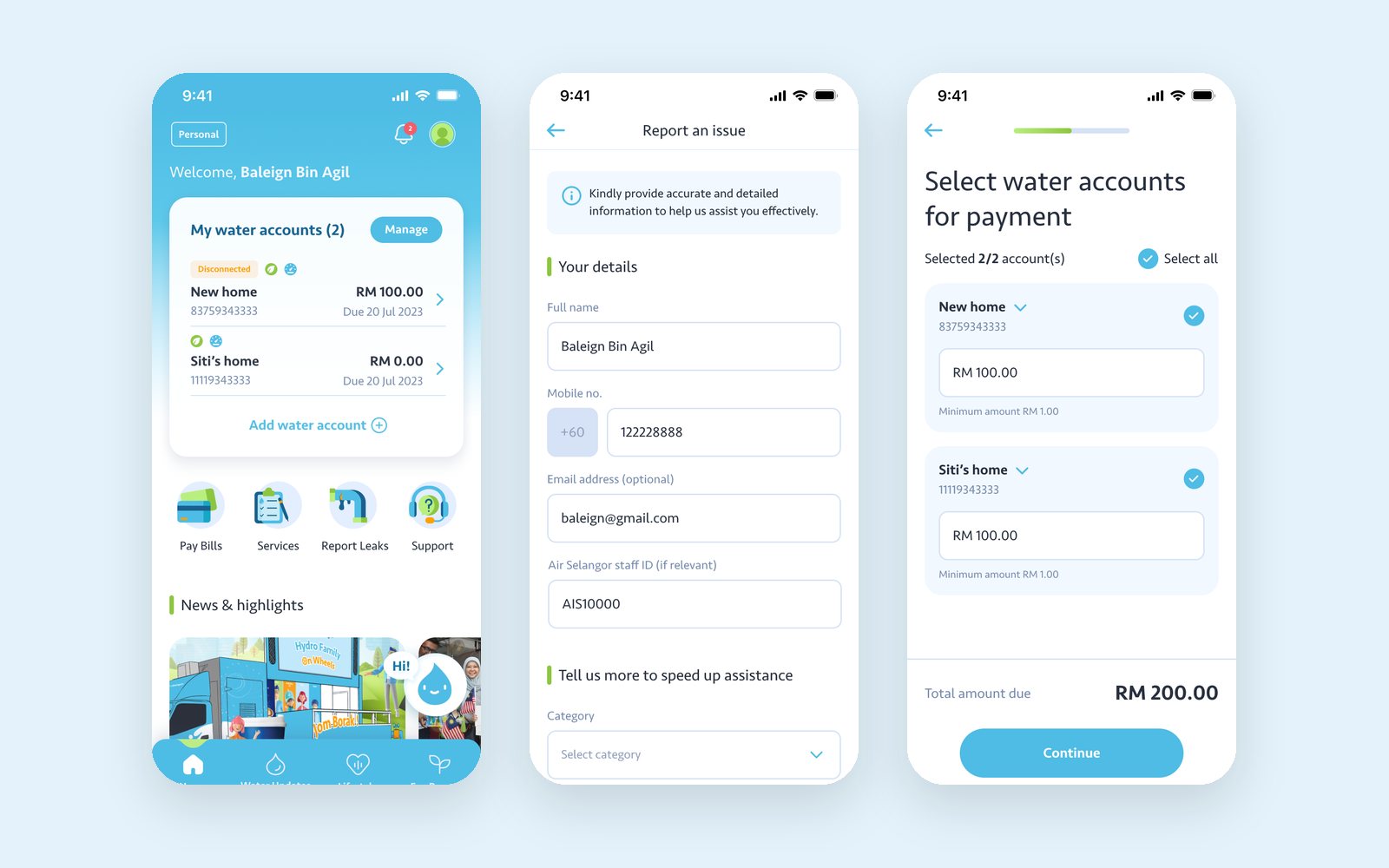
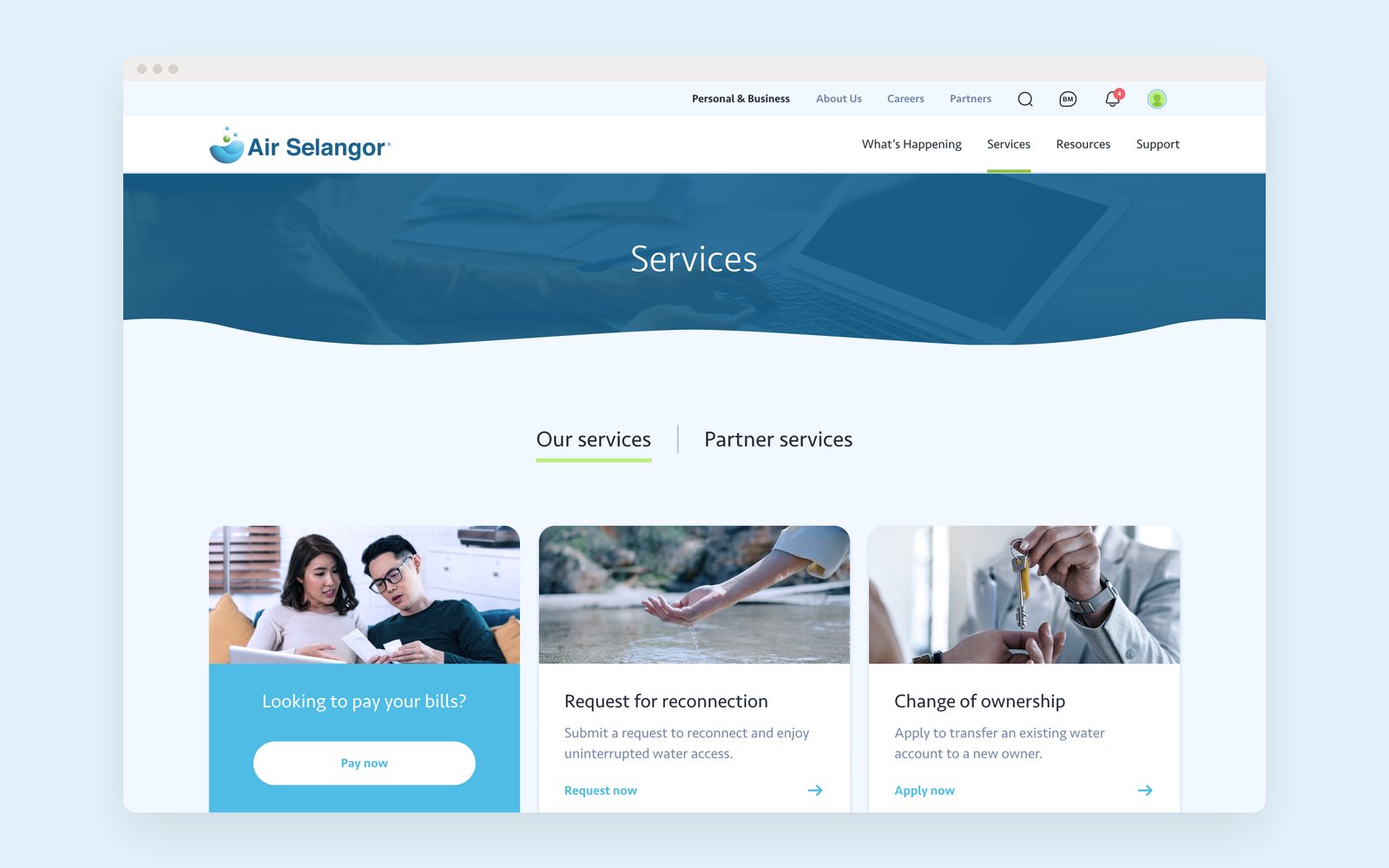
Selangor's state water utility (fun fact: "air" means water in Malay) was restructuring its website, customer portal and app, and moving paper processes online. I worked on the early phases of a multi-year partnership: mostly information architecture and research, about 15 to 20% visual.
1Information architecture. Site mapping and card sorting with staff, plus user research, to rebuild the content for residents, businesses, developers and rural users.
2Service design. With customer support, worked out which paper processes could move online and how they'd work on both sides.
3Core tasks. Registering, opening a water account, paying bills, getting help, and the app's login and onboarding.
App onboardingThe customer portalApp home, reporting a leak and paying a billThe website services page
Role
Designer
Via
Mango Digital
Year
2024
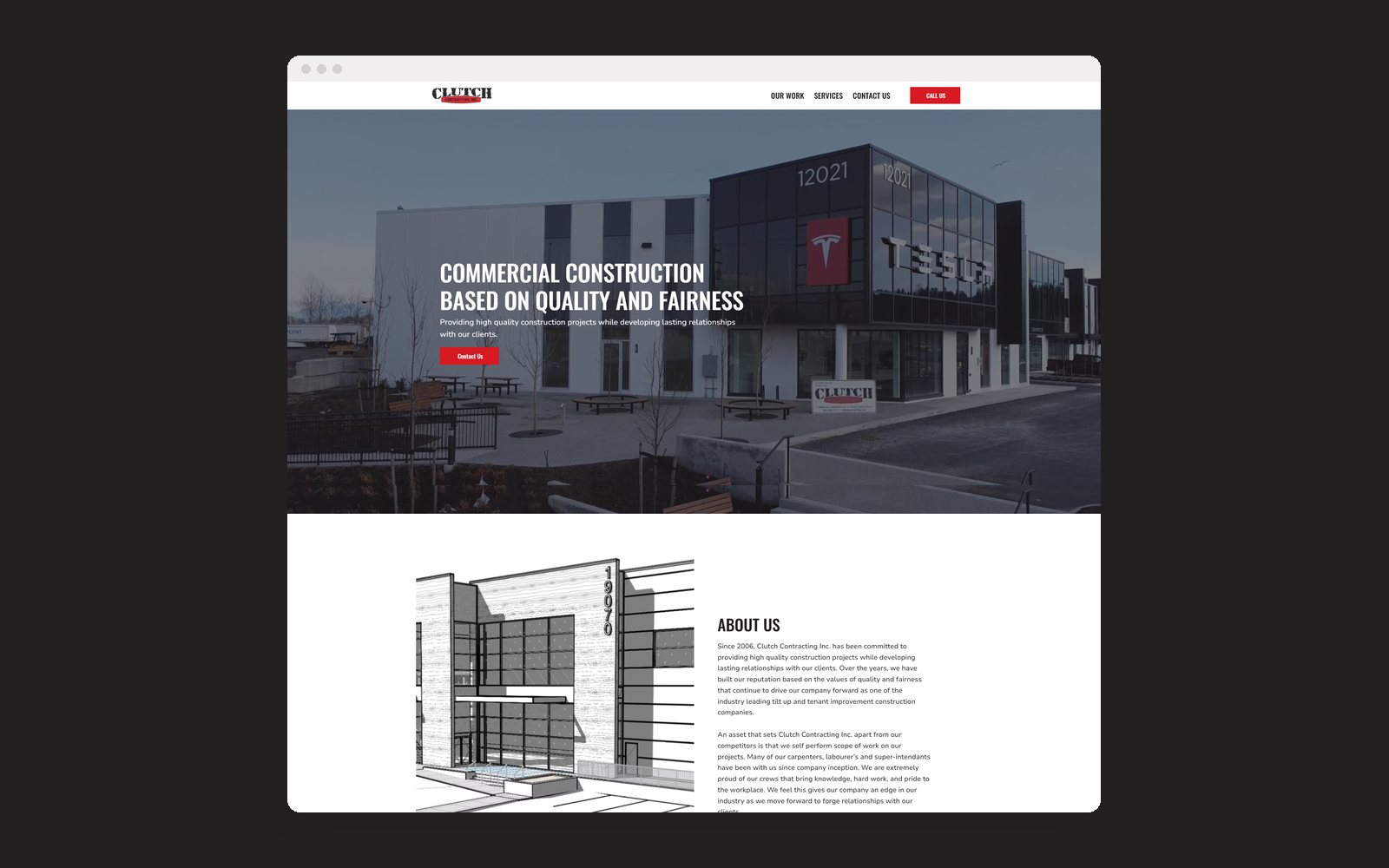
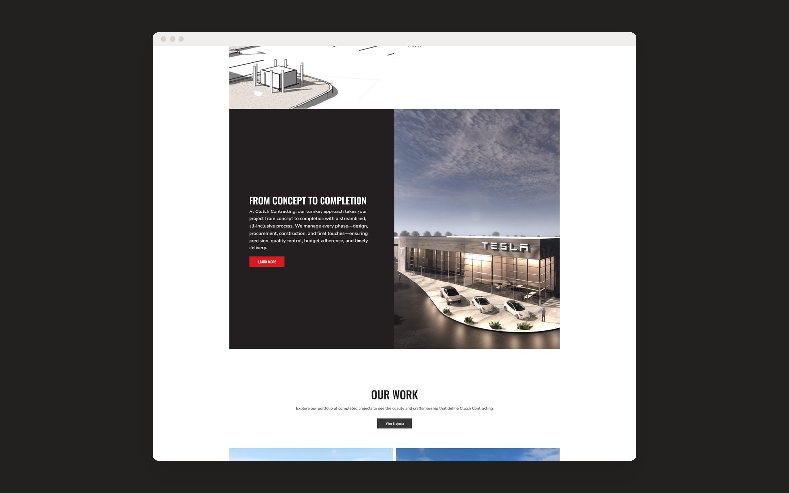
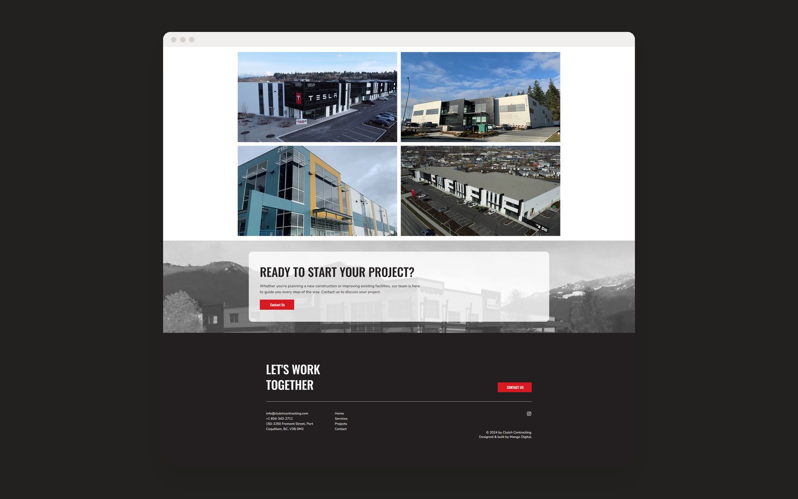
A contracting company needed a clearer look and a simple website it could run itself.
1Brand guidelines. Colour scheme, positioning and moodboards; the logo stayed as it was.
2Website. Designed and built the site on Wix, kept simple at the client's request.
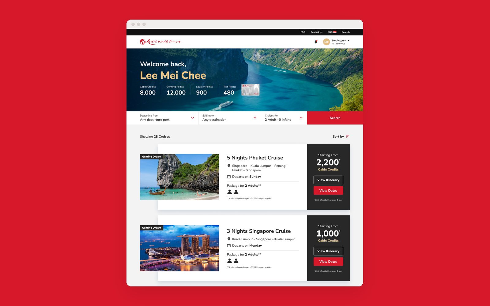
Members were calling and emailing support just to redeem their cruise points. I helped shape an MVP members' portal, covering product strategy, design and UX.
1Strategy. Competitor analysis and stakeholder sessions to balance members' needs now with plans for more point currencies.
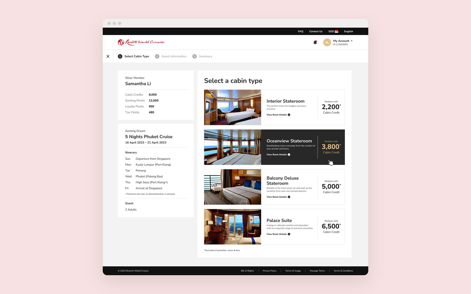
2Redemption rules. Strict rules, like one room per cruise and packages set by confirmed guests, made clear without overwhelming people.
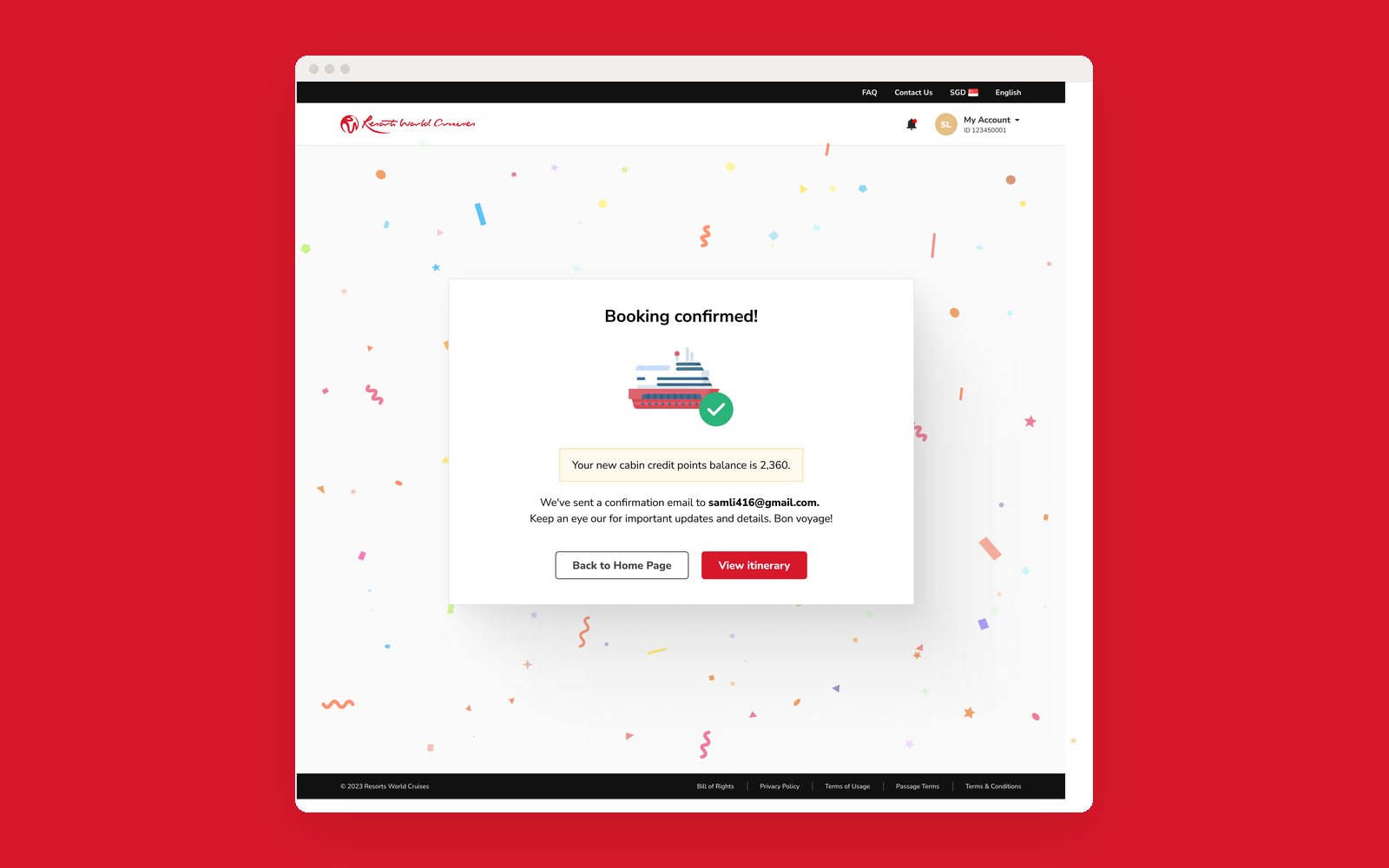
3The portal. Personalised onboarding, a dashboard for points and bookings, and booking with payment in one place.
Dashboard with points and cruisesChoosing a cabin with cruise creditsBooking confirmed
Role
Lead designer
Via
Independent
Year
2022 to 2023
A real estate startup with low traffic, a confusing website and branding that undercut trust. Over four months I led research, brand and web.
1Research. Pushed for and led competitor analysis, surveys, task analysis and interviews, which surfaced four problems: lost users, lost trust, frustration and drop-off.
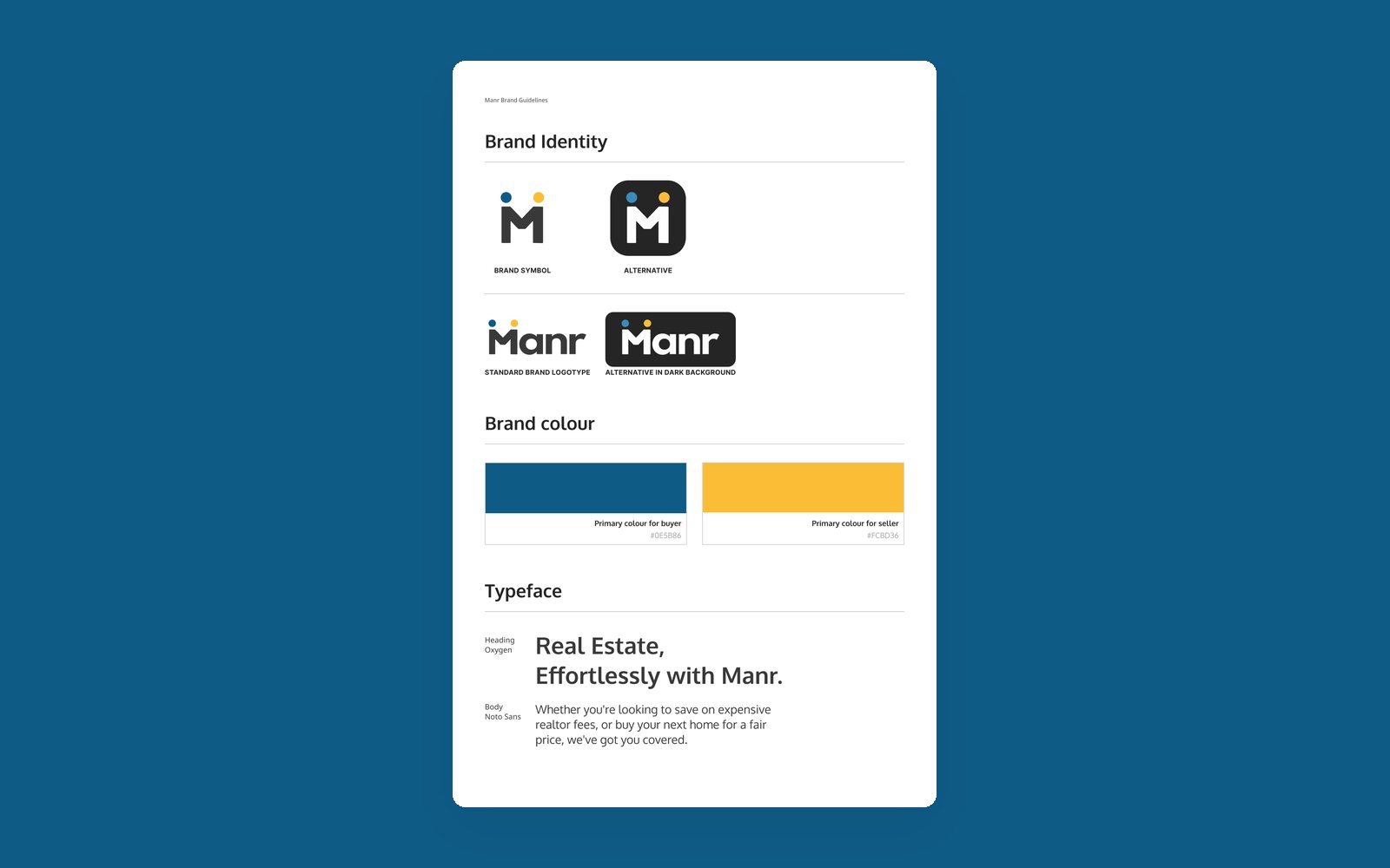
2Brand. A new identity that makes real estate feel approachable while still earning trust.
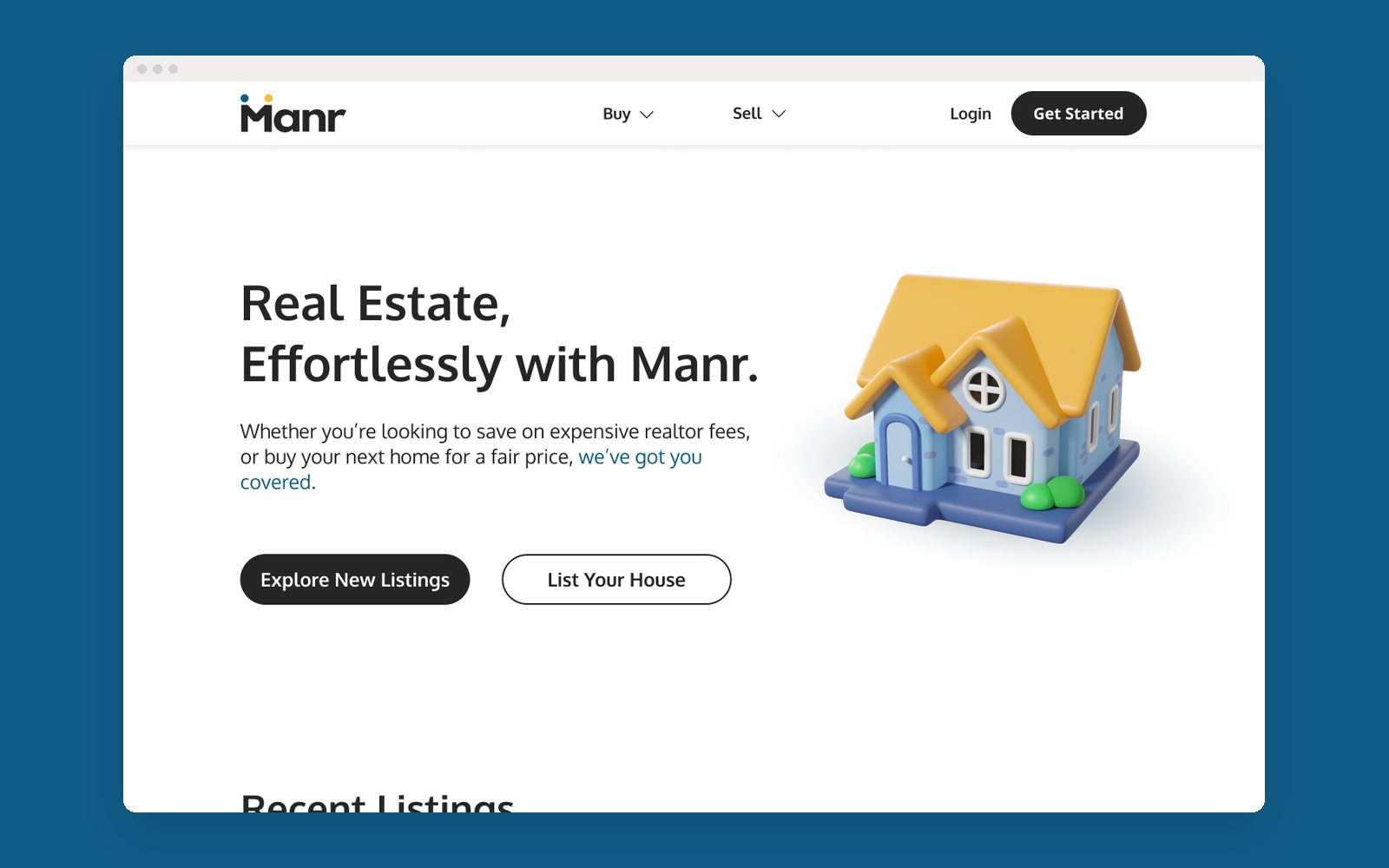
3Website. Redesigned around the new brand and the research findings.
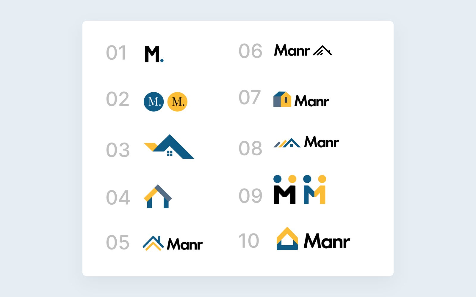
Brand identityLogo directions for the team voteFinal landing page